Brand identity
CSCHED
Brand identity
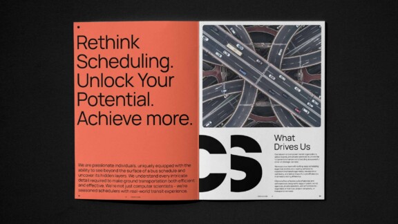
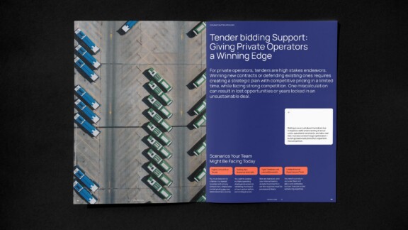
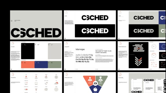
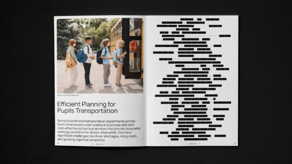
A clear, human, and contemporary brand image was developed to reflect its expertise and leadership role in the industry.
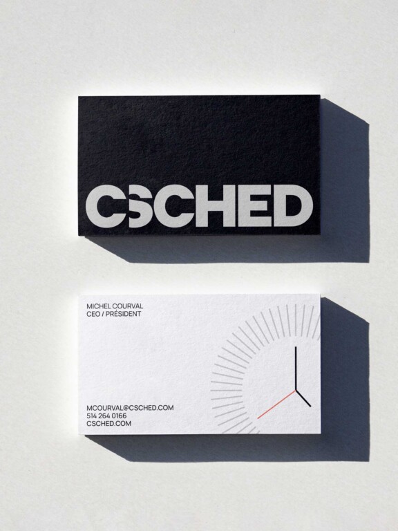
The logo was designed to be both minimalist and highly recognizable. The “C” is a reference to Courval—the founder’s surname—and the word “Consulting”. It opens to the right to introduce the rest of the CSched logo. This opening symbolizes scheduling, the often invisible but essential work involved in managing schedules in the transportation sector. The “Shed” portion thus appears as a continuation and a complement to the concept of consultation.


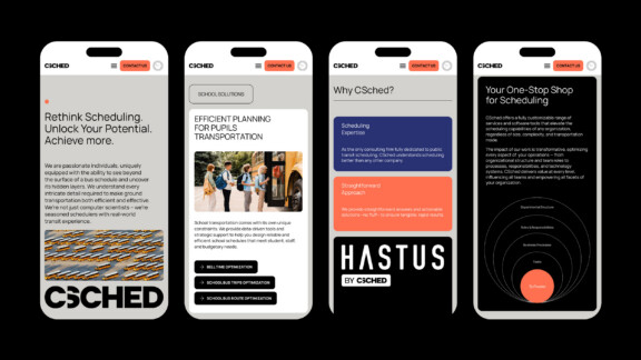
Both fluid and structured, the B2B website simplifies CSCHED’s extensive offering and helps potential clients identify their specific needs.
Fluid animations enliven the browsing experience without adding clutter, guiding users smoothly through complex information. The bottom line: showcase CSCHED’s value and drive prospective clients to initiate contact.
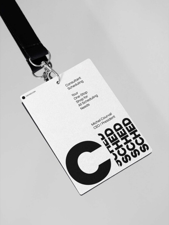

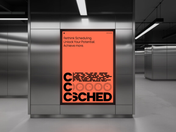
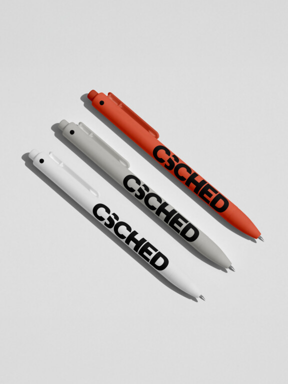

A strong brand identity embodying CSCHED’s core values of excellence, efficiency, and performance.



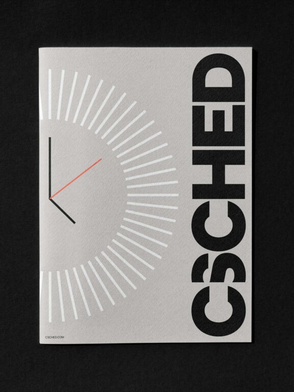
The brand’s graphic language draws from the industry’s distinct visual narrative, tapping into its key cues: time, scheduling precision, time-blocking, and bus fleet management.