Brand identity
Dual
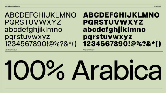
Brand identity
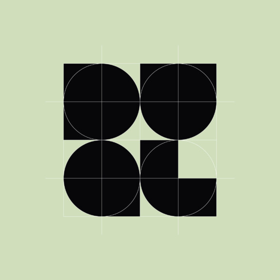
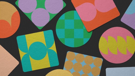
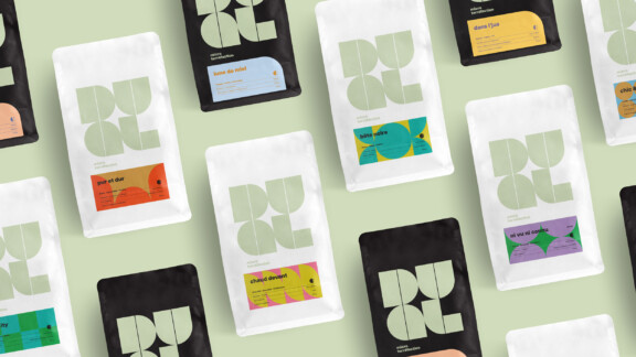
Jointly rooted in the Bauhaus style and the notion of duality, each of the logo’s four letters consists of two geometric shapes, and together they form a square. The negative space in the middle is a star, symbolizing the Dual brand.
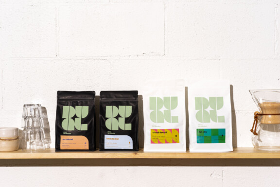
Even the labels, mini canvasses of contrasting colour schemes each uniquely inspired by the coffee names, have formal elements of the logo incorporated in their visual presentation.