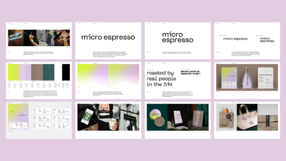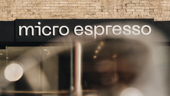
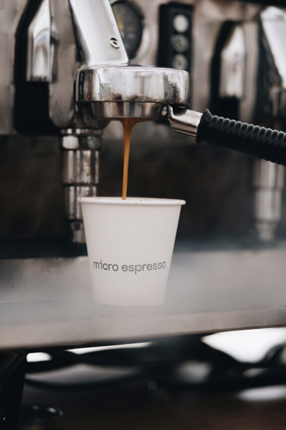
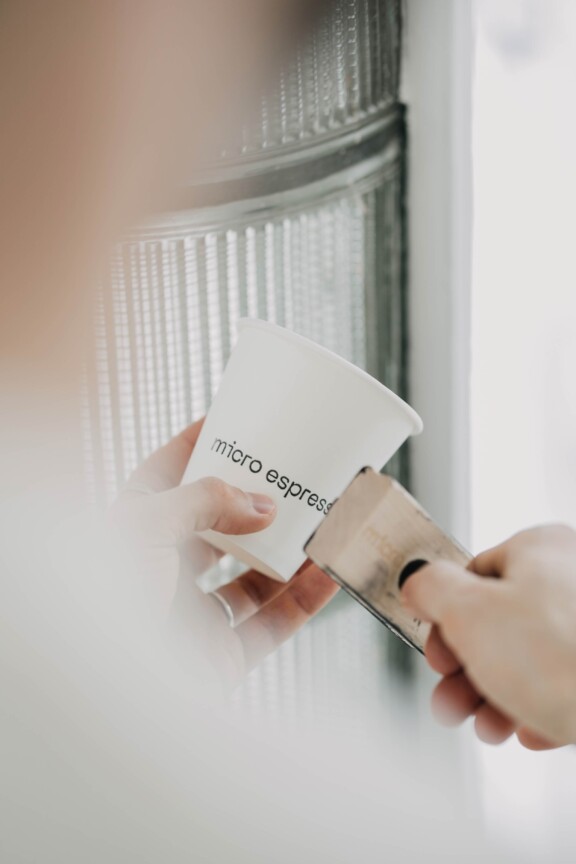
Brand identity
Micro Espresso
Brand identity
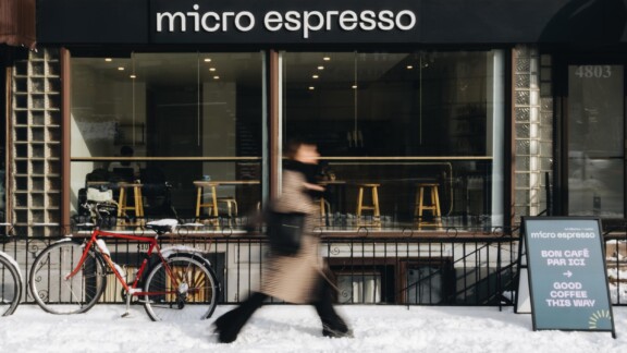
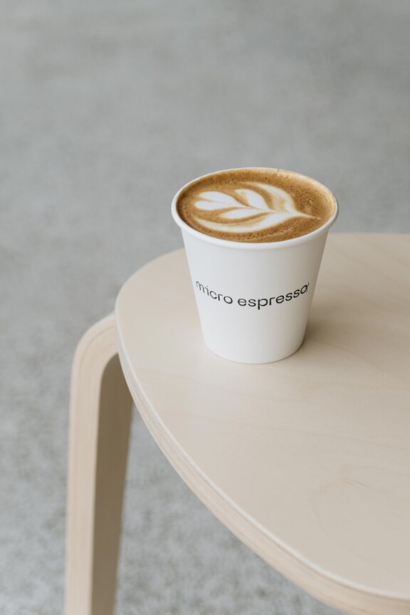
Roasted by real people — in the 514
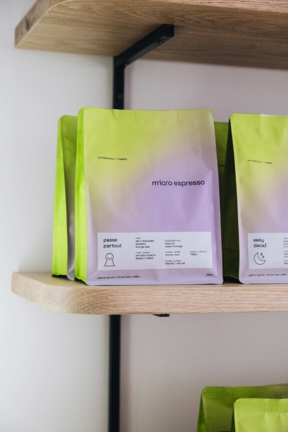
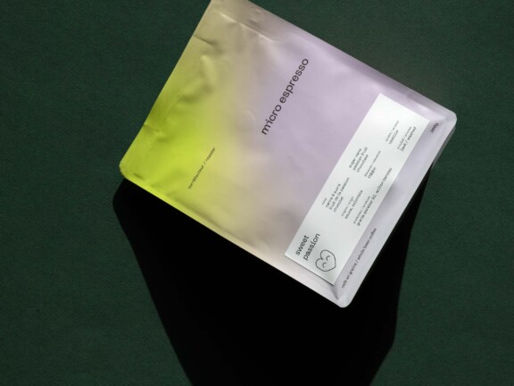
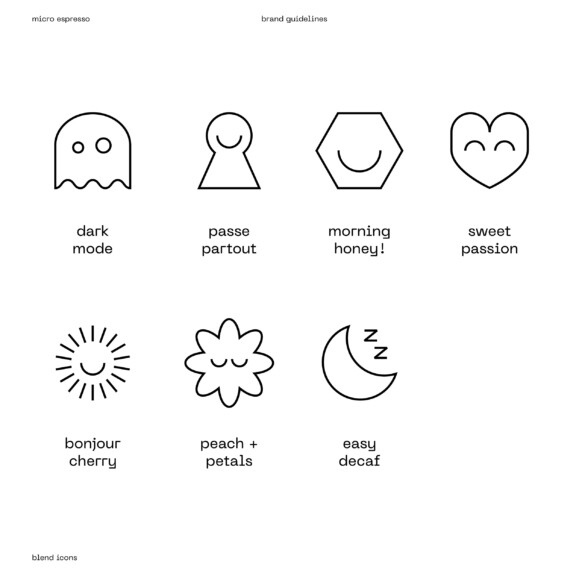
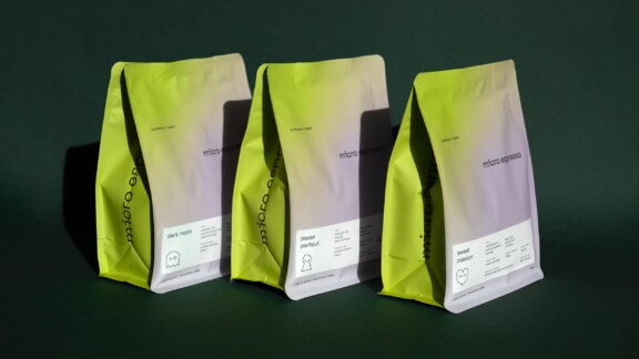
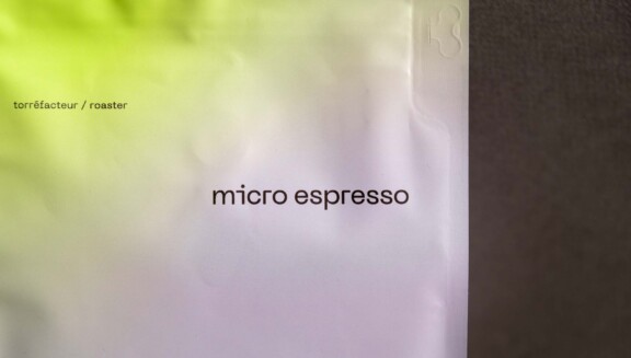
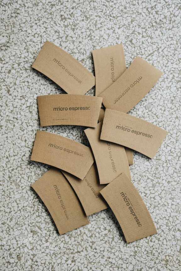
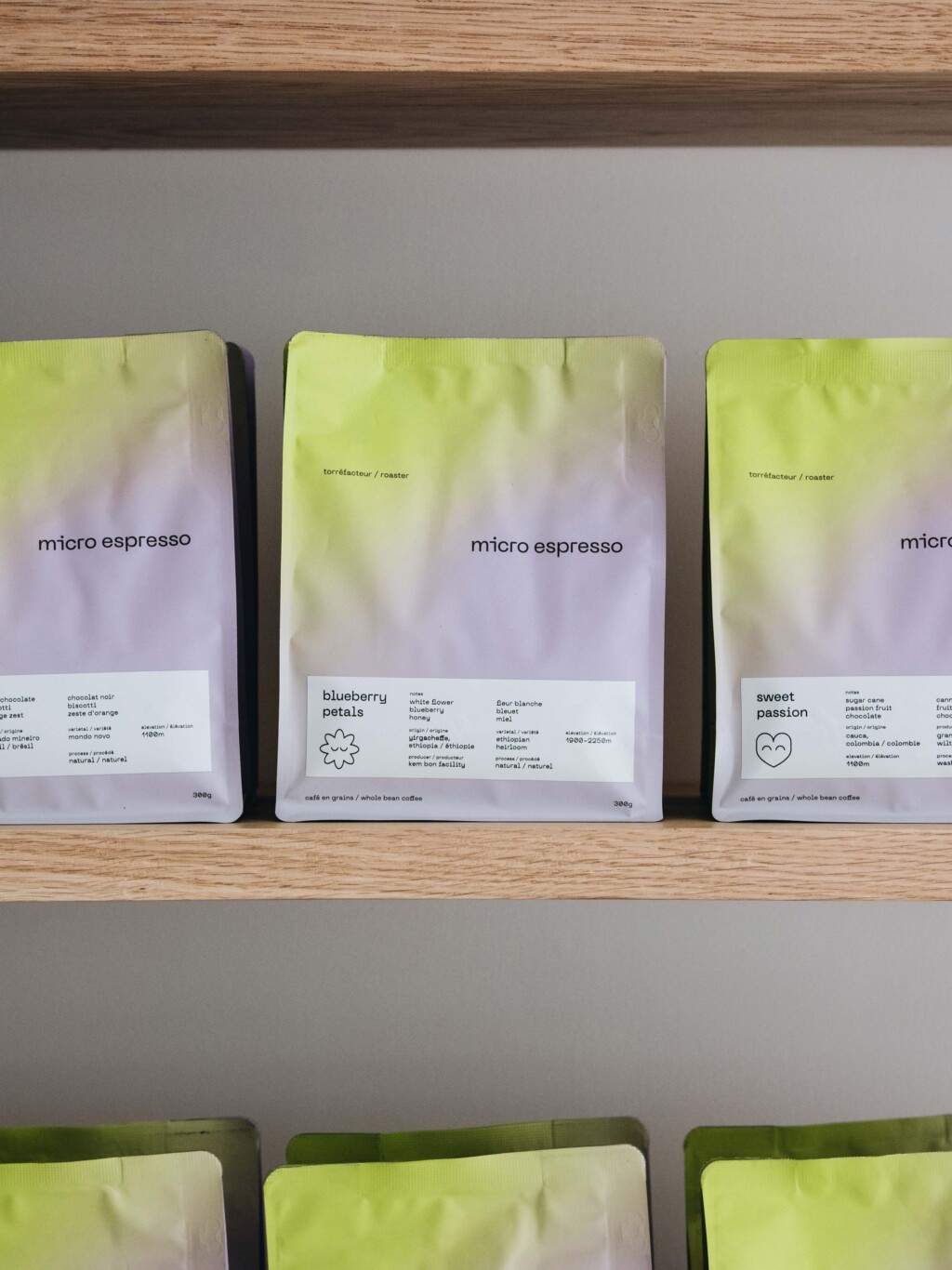
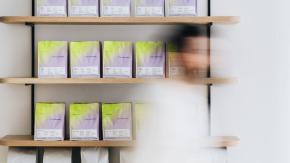
The branding’s use of techie-style gradients and playful iconography says “digital” yet “friendly.”
The colours reinforce this dialectic and are refreshingly different from the palette normally seen in the coffee world. The boldly minimalist bags serve as the bedrock of the brand and span a wide range visually, rendering them unmistakably recognizable at their different locations and on social media.