Protein smoothies
OLAOLA
Protein smoothies
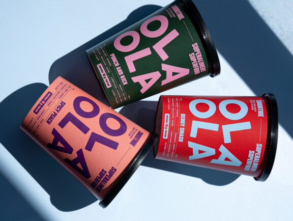
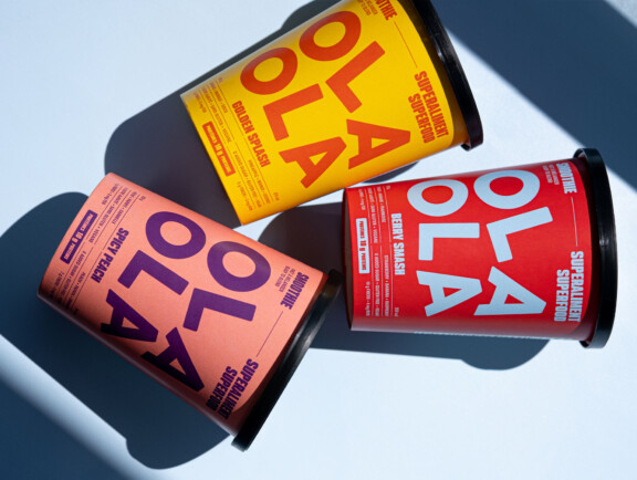
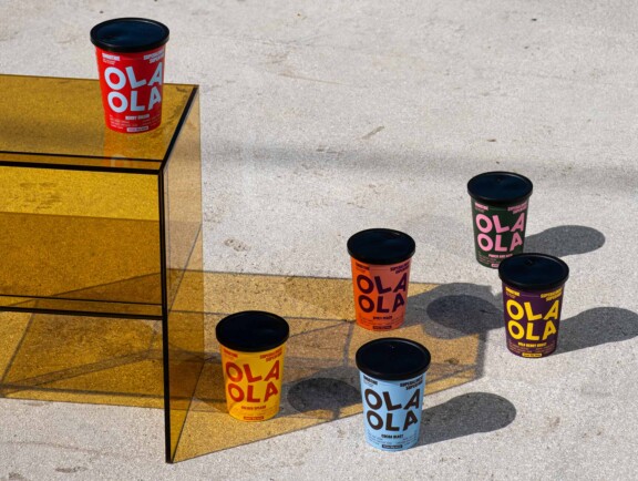
Line of cups branded in foodie colours that say vitamin-fortified, flavour-bursting smoothies
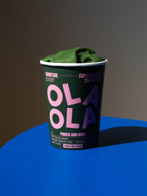
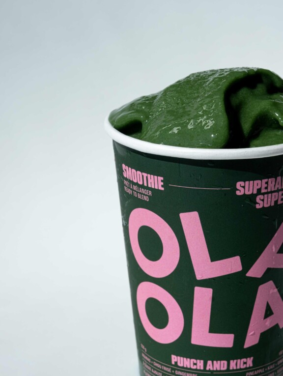
New line of cups developed for OLAOLA’s protein-rich smoothies.
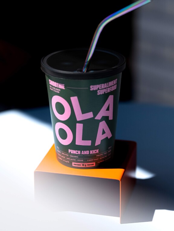
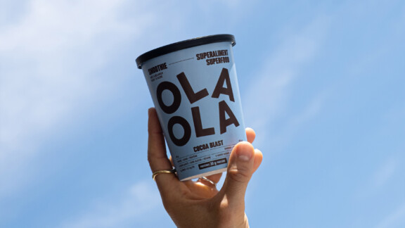
Packaging and a look specifically imagined for grab-and-go counters and events, and to convey the freshness of the ingredients and the diversity of their benefits. Playful and energetic, they reflect both the fun flavours and the vitality of the OLAOLA brand.
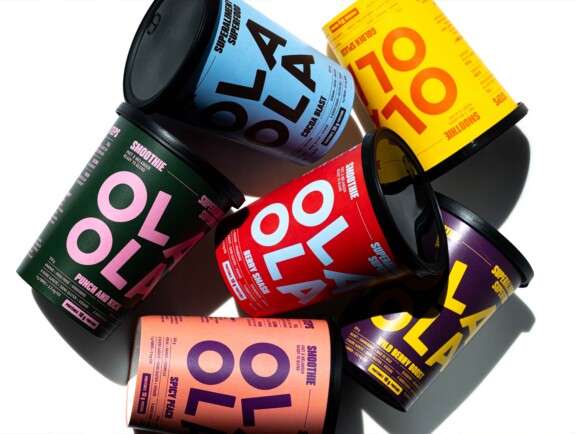
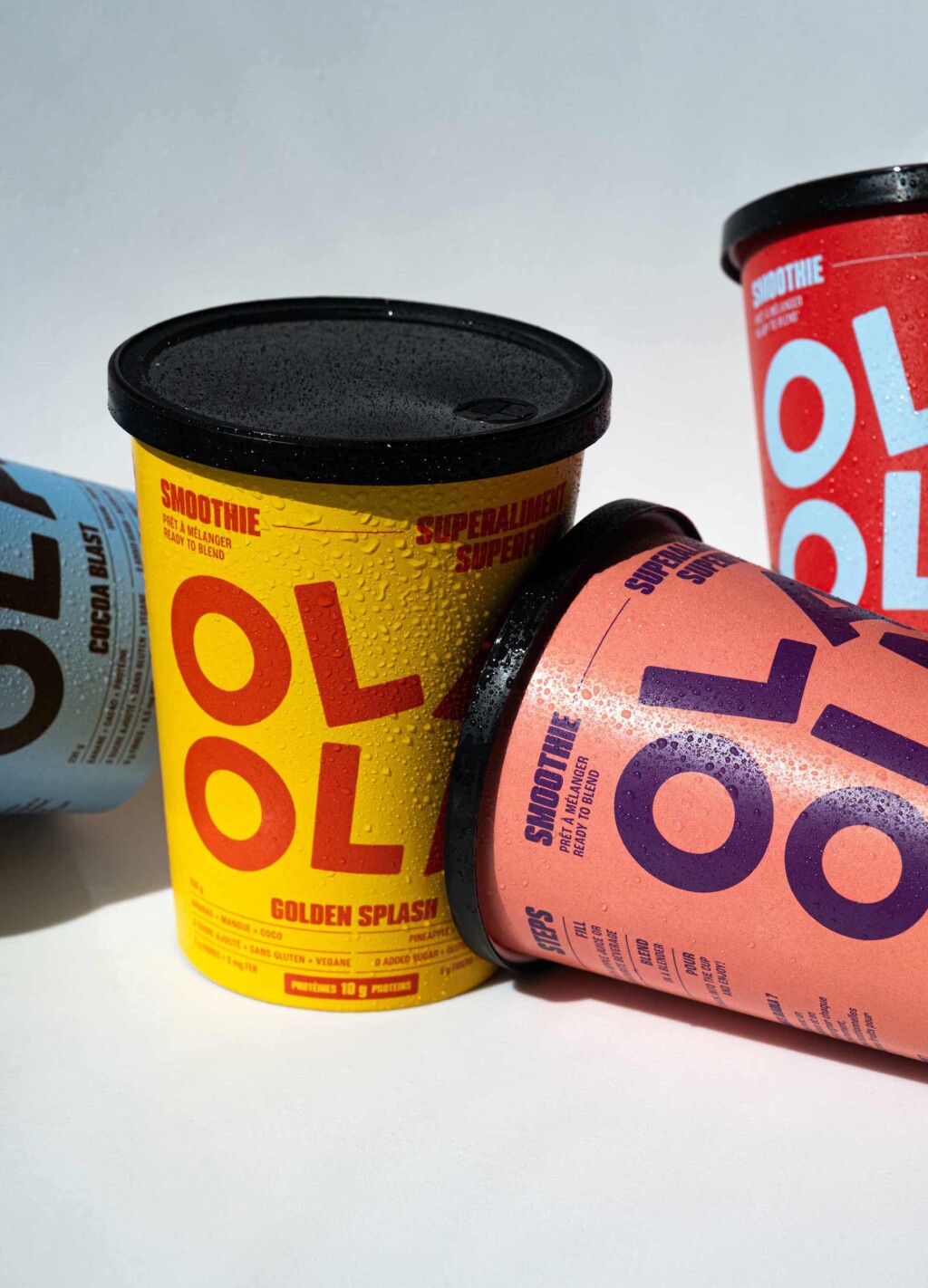
We reworked the logo to differ this line from its sister OLAOLA products, while remaining true to the branding: the two identical parts forming the name are superposed, and their seemingly random location on the cup evoke motion, which speaks to the mixing process required to make the smoothies.
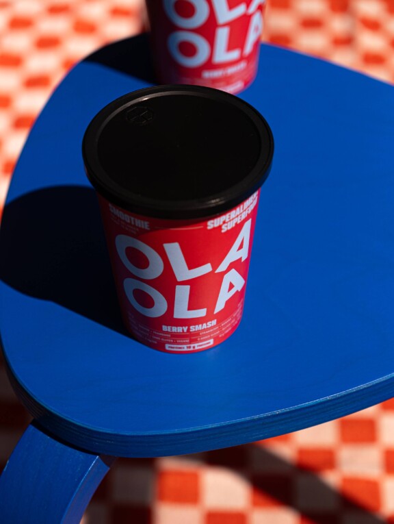
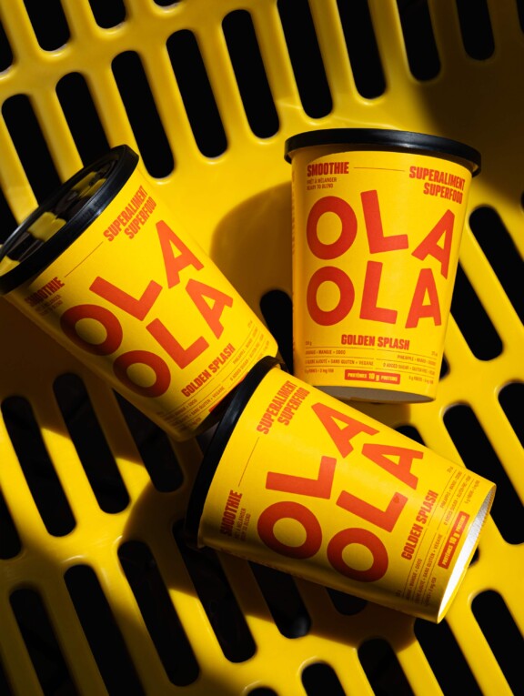
Contrasting yet vibrantly blended colours were creatively paired together to impart the boldness and inventiveness of OLAOLA’s mix-ready kits, making them instant attention-grabbers.
Each hue combination was carefully chosen to evoke the product’s flavour and personality, while maintaining OLAOLA’s playful modern branding. The result is an intriguing visual experience that appeals to your curiosity and sense of adventure at first sight.
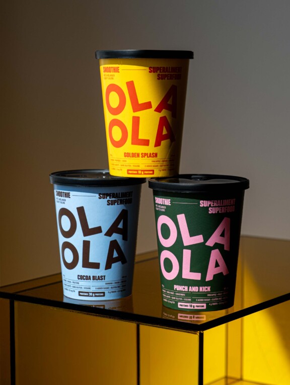
The font used, Podium Soft, is robust, ample and offers geometric clarity. It owns the space confidently while guiding one’s gaze. Its rounded forms and optimal legibility ensure consumers of this type of beverage capture the message and essential information intelligibly and intuitively, while also absorbing the nowness and vigour of the brand.
