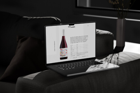
Brand identity
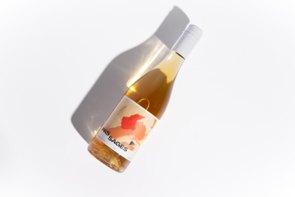
Pas Sages
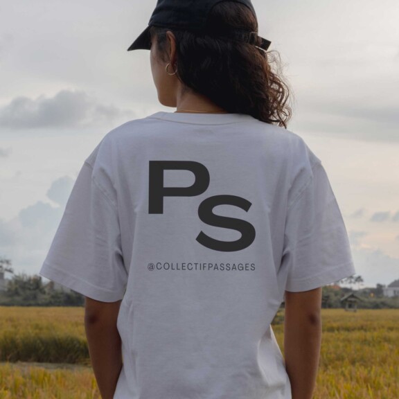
Brand identity


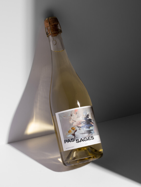
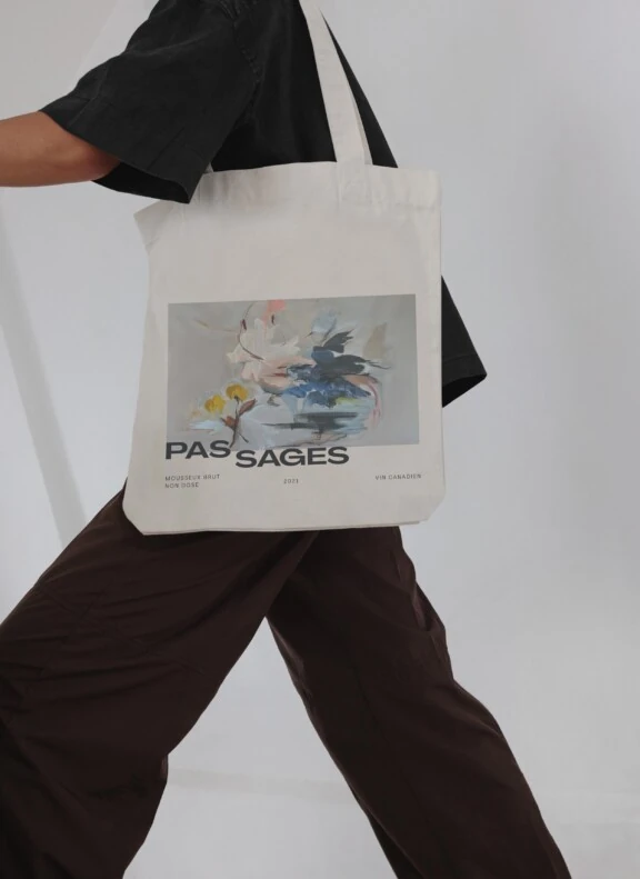
Canadian wines carefully curated with an eye for rare and special gems. A collection to please a crowd who’s always on the look out for new favourites.
Basalte was asked to create the branding for this collection of Canadian wines from top to bottom. The name, logo and label needed to reflect their vibrant, modern side, as well as a thirst for defying artistic conventions — to reframe expectations!

The name reads as a compound word or two separate words — a deliberate way to hint at the brand’s twin identities:
PASSAGES. Calls to mind water, so essential to viniculture, passing from lakes to rivers and so on. Also the knowhow being passed on along the chain and shared between winemakers, artists, sommeliers, etc.
PAS SAGES. In French, “pas sages” means mischievous, naughty, thus a play on being unabashedly hedonistic about the pleasures of the table. It is evident in the local flavour the artists from here poured into the labels.

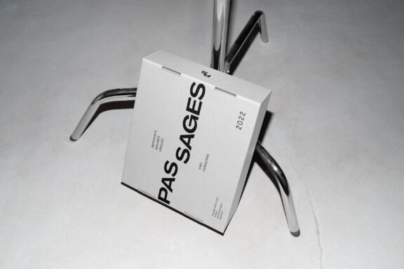
The Pas Sages logo typeface perfectly matches the brand’s identity: local and magnificently imperfect. It was created by a Montreal type foundry called Pangram Pangram to support the work of local artists. The typeface celebrates forms as they are meant to be, i.e. intuitive, authentic and organic.